
Typography
Consistent use of fonts and typographic treatments is critical to arXiv's identity. But within our framework there are options and room for creativity.
Base styles are built around Freight Text and Freight Sans typefaces. The Freight family draws from Cornell University’s branding and connect us stylistically with our parent organization. arXiv has several typographic styles based on Freight that range from elegant and sophisticated to edgy and bold. Use these guidelines to balance both consistency and spontaneity.
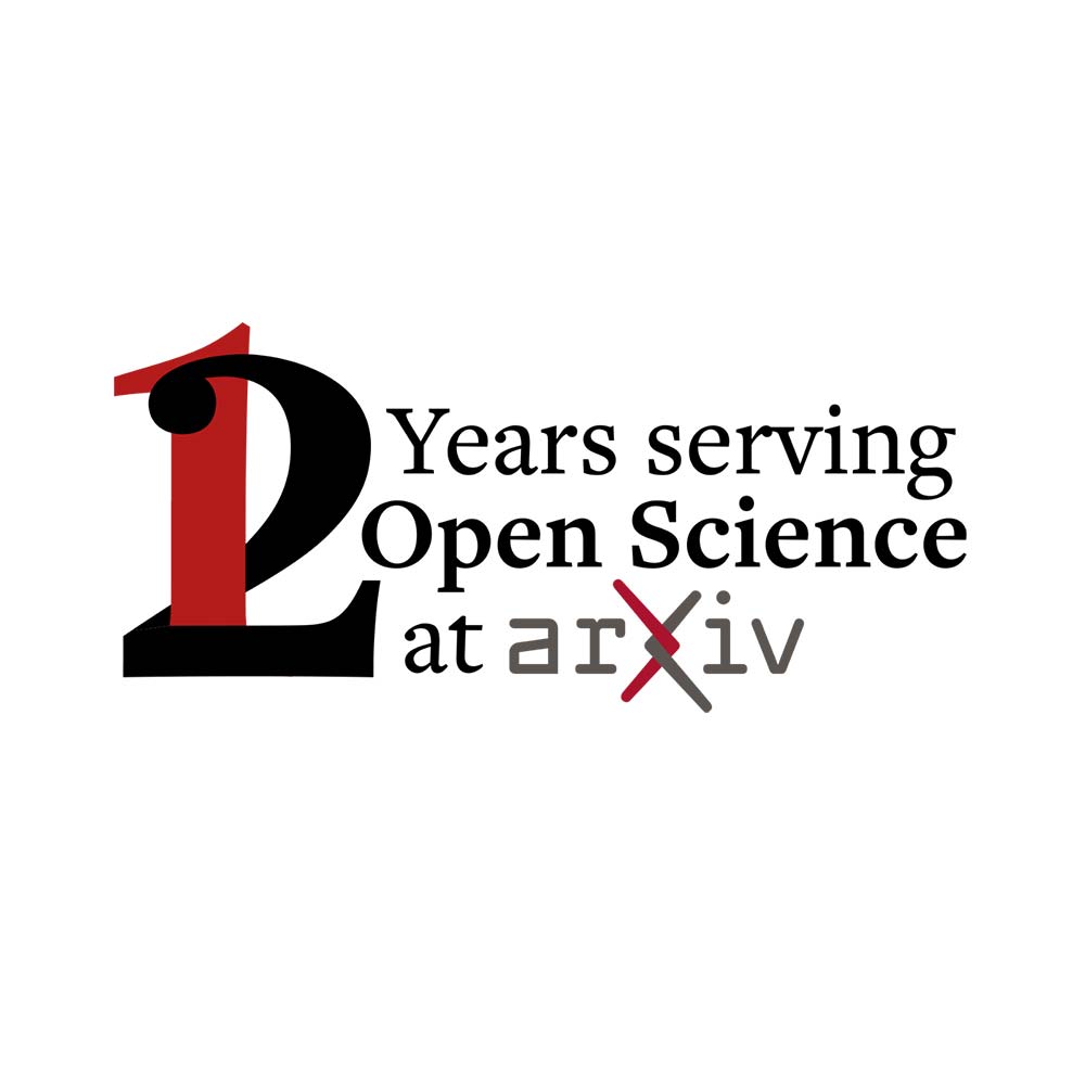
Architectural examples
This architectural treatment of the serif typeface allows for customization with consistency of style. Stacked lines of contrasting size and weight, and interplay of letterforms create elegance and visual interest without sacrificing legibility.
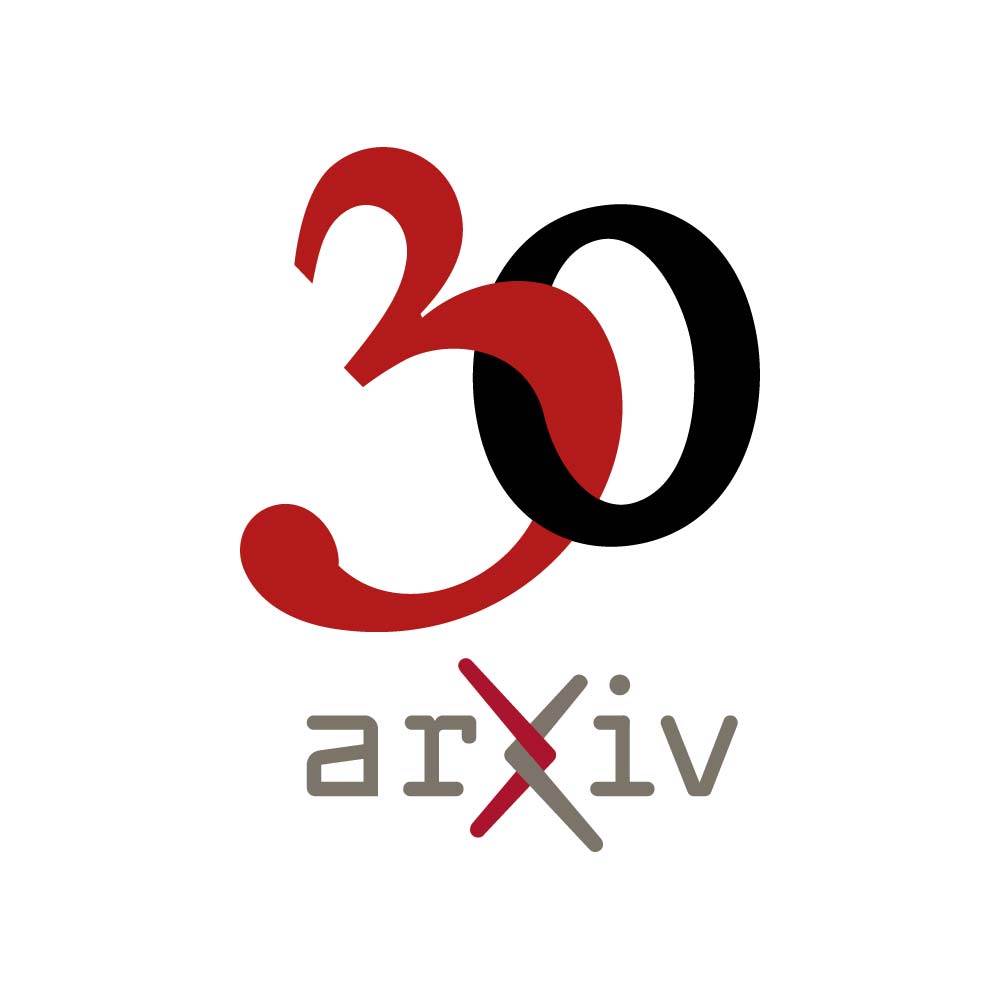
Intertwined Letterforms
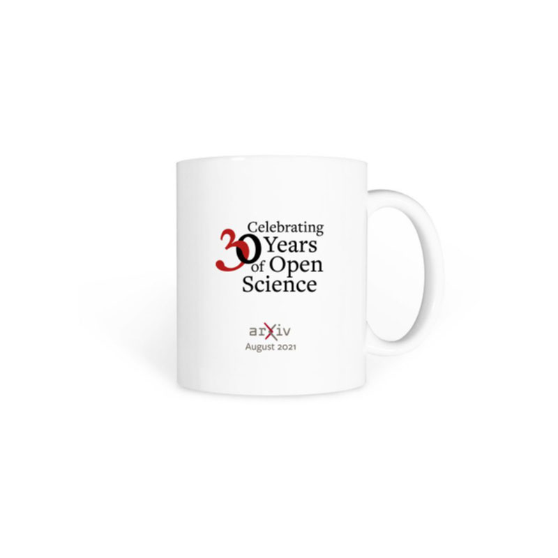
Intertwined letterforms—here celebrating our 30th anniversary and a logo extension—echo the intertwined arms of the chi in our logo.
Additional
See brand guidelines for taglines and quotes for additional type treatments that are part of the arXiv brand family.