Fonts
arXiv uses two main typefaces from the Freight family, and two accent typefaces. The Freight family draw from Cornell University’s branding and connect us stylistically with our parent organization. The accent typefaces add variation and interest, and are a bridge to our retro 90's roots.
Primary Typefaces
FreightText pro is our primary typeface. With high legibility and a classic, sophisticated look it is the workhorse of the arXiv look and feel:

FreightSans Pro elegantly complements it's serif sibling font. The clean lines of this sans serif face lend themselves well to larger uses like titles, and special use cases like callouts, sidebars, and other secondary content.

IBM Plex Sans Condensed is used for special cases where a bold face is called for. Special headings, annotations, limited horizontal space, or labels are all good candidates for IBM Plex Sans Condensed:

Larabiefont, in combination with Xenara, is customized as the basis of our logo. These fonts are used in logo lockups, logo extensions, and in the identies for special partnerships.

Alternative Google Fonts
When creating documents or slide decks in Google Docs, use the closest alternate font available, per the table below.
| Primary Font | Google Font Substitute |
|---|---|
| Freight Text Pro | Frank Ruhle Libre |
| Freight Sans Pro | Catamaran |
| IBM Plex Sans | IBM Plex Sans |
Examples
-
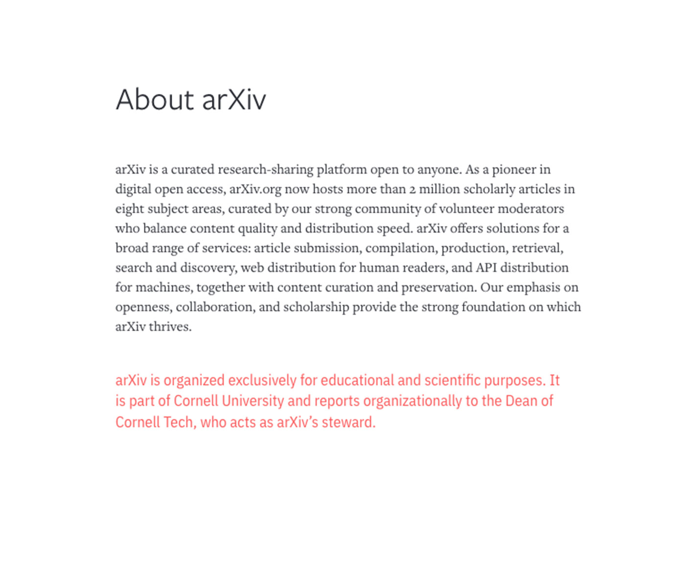
Title: Freight Sans Pro, Medium, Black
Body Copy: Freight Text Pro, Book, Black
Secondary copy: IBM Plex Sans Condensed in Publishing Pink
-
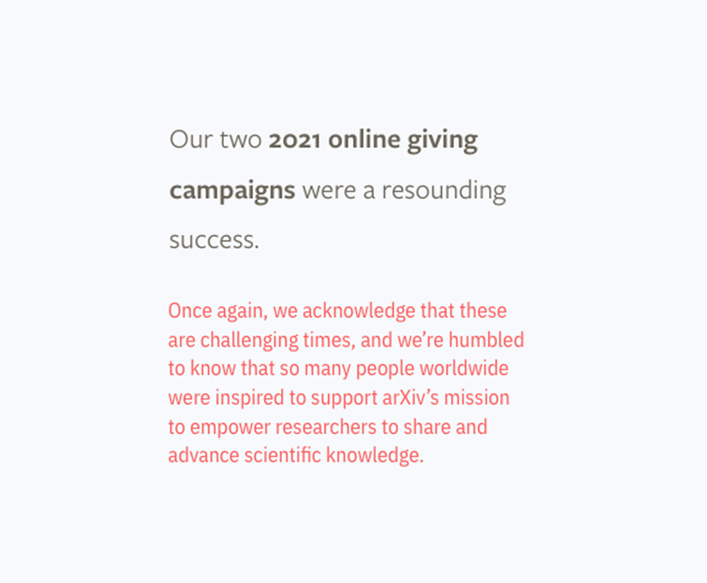
Callout: Freight Sans Pro, Book & Bold, in Library Grey
Highlight: IBM Sans Plex Condensed in Publishing Pink
Over a Light Blue background
-
Quotation: Freight Sans Pro, Book, in Library Grey with Light Grey highlighting
Attribution: Freight Sans Pro, Medium, in Library Grey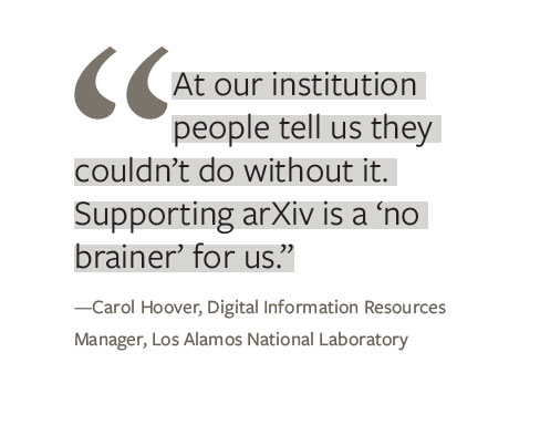
-
30th Anniversary identity: FreightText Pro, Bold in Cornell Red and Black

-
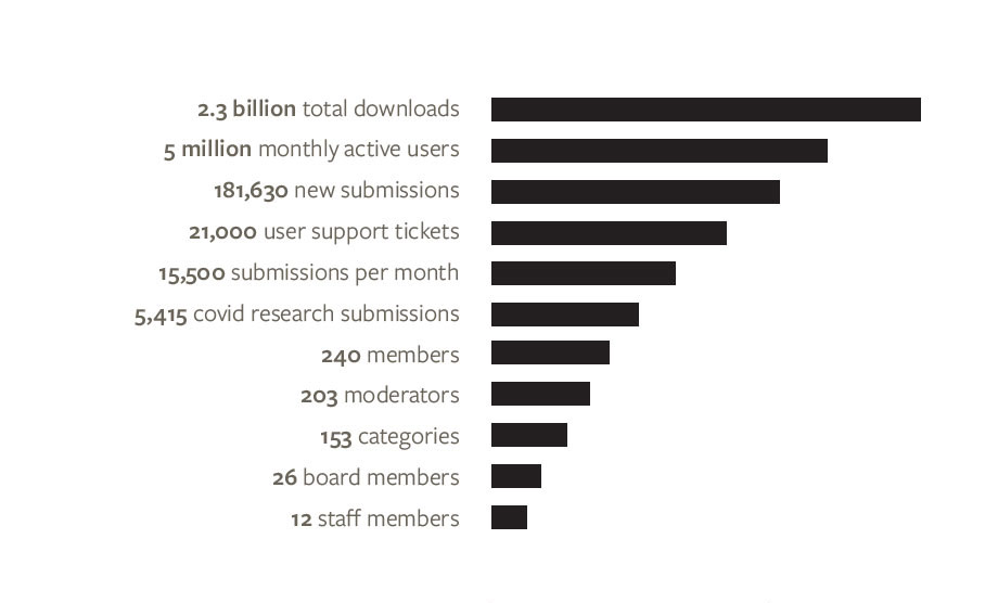
Infographic: FreightSans Pro, Bold and Medium, in Library Grey
